CSS Media Queries for Desktop, Tablet, Mobile
- Blog
- imharvindersingh
- December 31, 2022
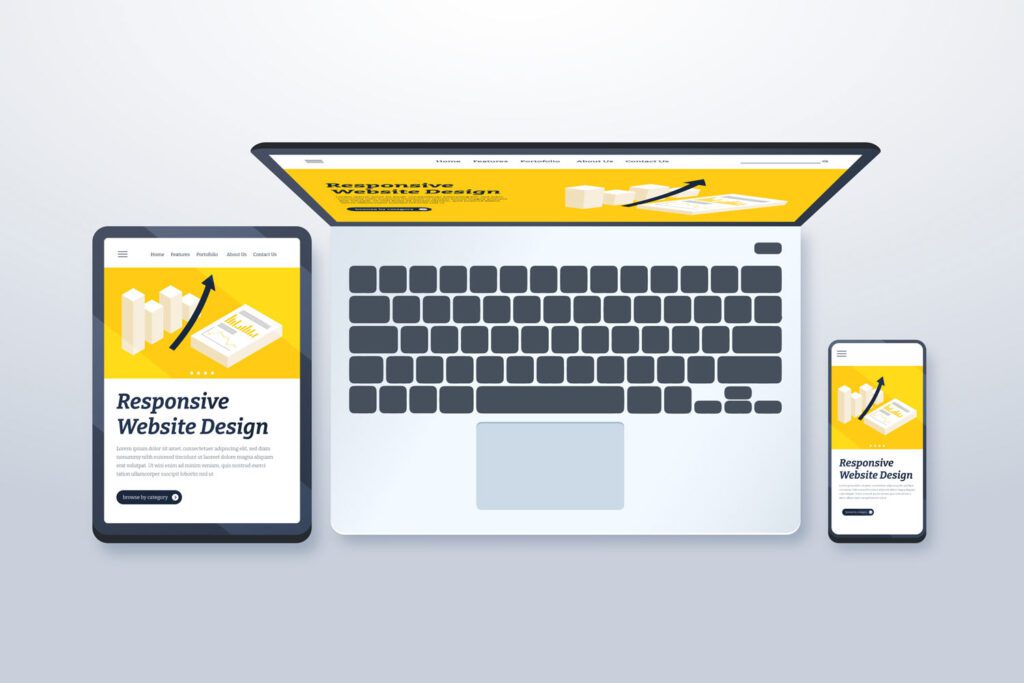
Media queries are a CSS3 feature that allow us to create responsive websites. They are used to change the layout of the website based on the size of the device’s screen.
The following table contains some examples of media queries for desktop, tablet and mobile devices:
					/*
  ##Device = Desktops
  ##Screen = 1281px to higher resolution desktops
*/

@media (min-width: 1281px) {

  /* CSS */

}

/*
  ##Device = Laptops, Desktops
  ##Screen = B/w 1025px to 1280px
*/

@media (min-width: 1025px) and (max-width: 1280px) {

  /* CSS */

}

/*
  ##Device = Tablets, Ipads (portrait)
  ##Screen = B/w 768px to 1024px
*/

@media (min-width: 768px) and (max-width: 1024px) {

  /* CSS */

}

/*
  ##Device = Tablets, Ipads (landscape)
  ##Screen = B/w 768px to 1024px
*/

@media (min-width: 768px) and (max-width: 1024px) and (orientation: landscape) {

  /* CSS */

}

/*
  ##Device = Low Resolution Tablets, Mobiles (Landscape)
  ##Screen = B/w 481px to 767px
*/

@media (min-width: 481px) and (max-width: 767px) {

  /* CSS */

}

/*
  ##Device = Most of the Smartphones Mobiles (Portrait)
  ##Screen = B/w 320px to 479px
*/

@media (min-width: 320px) and (max-width: 480px) {

  /* CSS */

}
Rate this post