Introduction
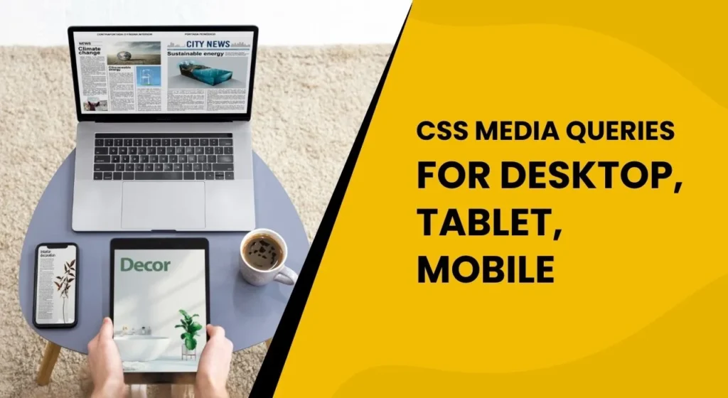
In today’s digital world, responsive websites are crucial. CSS media queries help achieve this by applying styles based on device characteristics like screen size, resolution, and orientation. With mobile browsing on the rise, ensuring a mobile-friendly design is essential. Using media screen css, media query for mobile, and css responsive media queries helps create optimal layouts for all devices, ensuring a seamless user experience. This blog will show you how to use CSS media queries to improve your website’s responsiveness.
Code Snippets for CSS Media Queries
Here are the essential CSS media query snippets that will help you target different devices, including desktops, tablets, and mobile devices. These queries ensure that your website layout is flexible and adapts based on the screen width and orientation.
/*
  ##Device = Desktops
  ##Screen = 1281px to higher resolution desktops
*/

@media (min-width: 1281px) {

  /* CSS */

}

/*
  ##Device = Laptops, Desktops
  ##Screen = B/w 1025px to 1280px
*/

@media (min-width: 1025px) and (max-width: 1280px) {

  /* CSS */

}

/*
  ##Device = Tablets, Ipads (portrait)
  ##Screen = B/w 768px to 1024px
*/

@media (min-width: 768px) and (max-width: 1024px) {

  /* CSS */

}

/*
  ##Device = Tablets, Ipads (landscape)
  ##Screen = B/w 768px to 1024px
*/

@media (min-width: 768px) and (max-width: 1024px) and (orientation: landscape) {

  /* CSS */

}

/*
  ##Device = Low Resolution Tablets, Mobiles (Landscape)
  ##Screen = B/w 481px to 767px
*/

@media (min-width: 481px) and (max-width: 767px) {

  /* CSS */

}

/*
  ##Device = Most of the Smartphones Mobiles (Portrait)
  ##Screen = B/w 320px to 479px
*/

@media (min-width: 320px) and (max-width: 480px) {

  /* CSS */

}What Are CSS Media Queries?
CSS media queries are a fundamental feature of responsive web design. They allow web developers to apply different sets of styles depending on the characteristics of the user’s device. A media query can check for several factors, such as the width, height, resolution, and orientation of the device screen. By using media queries, developers can ensure that their websites display appropriately on various devices, from small mobile phones to large desktop monitors.

Basic Media Query Syntax
To understand how CSS media queries work, let’s take a look at the basic syntax:
@media (condition) {
  /* CSS rules here */
}In this syntax, the condition refers to the characteristic of the device that you want to target, such as screen width or orientation. The styles inside the media query will only apply if the condition is met.
CSS Media Queries for Different Devices
In this section, we’ll discuss how to use media queries for different devices, focusing on desktops, tablets, and mobile devices. This will help you ensure that your website provides an optimal experience across all screen sizes.

1. Media Query for Desktops
Desktops generally have larger screen resolutions compared to tablets and smartphones. To target desktops, we use a media query with a min-width condition, ensuring that the styles are applied to screens larger than 1281px.
/* Device = Desktops */
@media (min-width: 1281px) {
  /* CSS for desktop */
}This query targets desktops with a screen width of 1281px or larger. It’s ideal for providing a spacious layout and large images, which are well-suited for desktop displays.
2. Media Query for Laptops and Desktops
When dealing with laptops and medium-sized desktops, screen resolutions typically range from 1025px to 1280px. To target these devices, use the following media query:
/* Device = Laptops, Desktops */
@media (min-width: 1025px) and (max-width: 1280px) {
  /* CSS for laptops and desktops */
}This media query applies to devices with screens between 1025px and 1280px wide. It’s useful for ensuring that websites look great on laptops and medium desktops, providing a balanced layout for medium-sized screens.
3. Media Query for Tablets in Portrait Orientation
Tablets in portrait orientation have screen widths ranging from 768px to 1024px. To target tablets in portrait mode, use the following media query:
/* Device = Tablets, Ipads (Portrait) */
@media (min-width: 768px) and (max-width: 1024px) {
  /* CSS for tablets in portrait mode */
}By targeting this range, you ensure that your layout is optimized for tablet screens, delivering a great user experience on smaller devices.
4. Media Query for Tablets in Landscape Orientation
When tablets are held in landscape mode, the screen becomes wider. To accommodate this, you can use the following media query:
/* Device = Tablets, Ipads (Landscape) */
@media (min-width: 768px) and (max-width: 1024px) and (orientation: landscape) {
  /* CSS for tablets in landscape mode */
}This query is ideal for tablets in landscape orientation, ensuring that the layout adjusts accordingly for a wider screen.
5. Media Query for Low-Resolution Tablets and Mobile Devices in Landscape
For smaller tablets and smartphones with lower resolutions, use the following media query to target screens with widths between 481px and 767px:
/* Device = Low Resolution Tablets, Mobiles (Landscape) */
@media (min-width: 481px) and (max-width: 767px) {
  /* CSS for smaller tablets and large mobiles in landscape mode */
}This query ensures that devices with lower screen resolutions are catered to with a suitable layout.
6. Media Query for Smartphones in Portrait Mode
The most common screen size for smartphones is between 320px and 480px wide. For smartphones in portrait orientation, use this media query:
/* Device = Most Smartphones (Portrait) */
@media (min-width: 320px) and (max-width: 480px) {
  /* CSS for smartphones in portrait mode */
}This query targets smartphones in portrait mode, providing optimized styles for the small screens commonly used by mobile users.
Advanced CSS Media Queries Techniques
While the basic media queries help in adjusting layout styles based on screen size, there are also more advanced techniques that can be applied to enhance the responsiveness of your site. Let’s explore some of these techniques:

1. Using Media Feature Ranges
Instead of targeting a single value for min-width or max-width, you can also target a range of values. For instance, you can combine min-width and max-width in a single media query:
@media (min-width: 480px) and (max-width: 1024px) {
  /* CSS for devices between 480px and 1024px */
}This allows you to create more specific breakpoints for a wider variety of devices.
2. Combining Media Queries with JavaScript
You can also use media queries alongside JavaScript for dynamic styling. This is especially useful when you want to make changes to your website’s layout or content based on the screen size, such as changing text size or layout grid dynamically.
if (window.matchMedia("(max-width: 768px)").matches) {
  // Apply changes for mobile devices
} else {
  // Apply changes for larger screens
}3. Accessibility Considerations
When working with responsive design, it’s essential to consider the accessibility of your site. Ensure that text remains readable on smaller screens and that interactive elements are touch-friendly. Adjusting font sizes, padding, and button sizes using media queries will enhance usability across all devices.
Conclusion
CSS media queries are an essential tool for any web developer who wants to create a responsive website. By understanding and implementing these queries, you can ensure that your website looks great on all devices, from desktops to smartphones. Whether you’re building a mobile-first site or optimizing an existing one, CSS media queries provide a simple and effective way to deliver a seamless user experience. if you need to learn full online CSS, learn on w3schools.
By using the techniques and examples provided in this blog, you can ensure that your website adapts well to various screen sizes and orientations. Always remember to test your site across multiple devices to ensure the best user experience.
Frequently Asked Questions
1. What are CSS media queries?
CSS media queries allow developers to apply different styles depending on the characteristics of the user’s device, such as screen size, orientation, and resolution.
2. How do I use CSS media queries?
You can use media queries by defining conditions such as min-width or max-width, and applying CSS rules that only take effect when these conditions are met.
3. What is the difference between min-width and max-width?
min-width targets screens larger than the specified value, while max-width targets screens smaller than the specified value.
4. Can I target specific devices using media queries?
Yes, you can target devices based on characteristics such as screen width, height, resolution, and orientation using media queries.
5. What are the best breakpoints for responsive design?
Common breakpoints are used in CSS Media Queries:
– Mobile: 320px to 480px
– Tablets: 481px to 1024px
– Desktops: 1025px and above